Ever seen someone’s choice of paint colour on Instagram and instantly wanted to redecorate? Yep, me too.
Paint is seemingly one of the best ways to transform a space, and after speaking with the colour experts earlier this year, you may subconsciously not be opting for bolder colours in your home because you’re afraid of judgement.
Colour IS good for our soul, how we express ourselves and how our home feels. So, if you’re ready to embrace colour and redecorate your living room in the coming months, keep reading for my pick of the best Farrow and Ball living room colour scheme ideas (and stunning examples of them in situ).
11 Flawless Farrow and Ball Living Room Colour Scheme Ideas
There is so much inspiration to take from Farrow and Ball’s extensive collection of colours, in recent years there has been a rise in grey washing, and more recently drenching an interior in ‘beige’ which can feel flat and personality less.
So, to get you out of your comfort zone, we’re sharing the most powerful designs that will enable you to confidently choose and execute colour in your living room (I love Skimming Stone as much as the next person, but THIS is where the magic happens).
1.Playful, Contemporary Combination of Colours
Can we take a moment to appreciate this gorgeous combination of colours? There’s a myth that blue and green don’t work together, and hopefully this is proof that they do!
Green and blue are next to one another on the colour wheel, this is known as analogous colours, when placed together they look aesthetically pleasing and deliver a calming effect.
In this period living room, they have used Sardine on the main walls, a a silvery blue with a gorgeous avocado green splash on the window wall with Yeabridge Green. Powerful, yet calming and restful.


2. The Ultimate Cosy Colour
Railings is one of the most popular Farrow and Ball colours, and hotly used all across Instagram.
Using a deep colour like this is one of the best ways to create a cosier setting, especially important in a room for relaxation like a living room.
Colour drenching the entire room can make it feel cosier, but it’s not great for smaller rooms as it makes the walls feel closer together. Instead, add a dado rail and paint upwards in a bright white such as F&B All White.

Instagram Image Credit: @deorling_
3. Lean Into Blue
Blue can be a cold colour in certain spaces, especially North facing rooms and East facing living rooms that have a lot of use in the evenings.
But if you have a South facing room, a blue can be a great way to counteract the intensity of the sunlight, whilst you may also choose to lean into darker hues like blue in a North facing room for a cosier feel.
Stiffkey Blue features here, a gorgeous inky blue shade that looks great in this colour drenched look across the walls and fireplace. Don’t be afraid to pair with black accents, it will deliver added definition to the overall room.

4. Dare To Go With Baby Pink, No Seriously
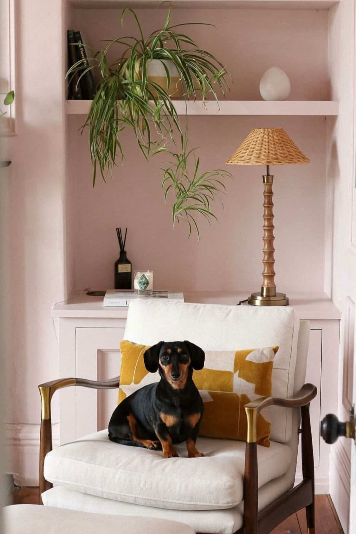
Calamine is one of my favourite pink shades by Farrow and Ball. Whilst it does bring a touch of femininity to a living room, it can be a great alternative to a beige or cream neutral, yet it’s still calming and soothing in a space (much like the lotion it’s named after!)
Introduce warm, bright colours into the scheme such as green, yellow and wooden tones. A lovely way to introduce green is by painting your architraves and doors in a complementary green colour – try Cromarty for a sage green, or Green Smoke for a stronger look.

5. Add A Restorative Feel With Green Smoke
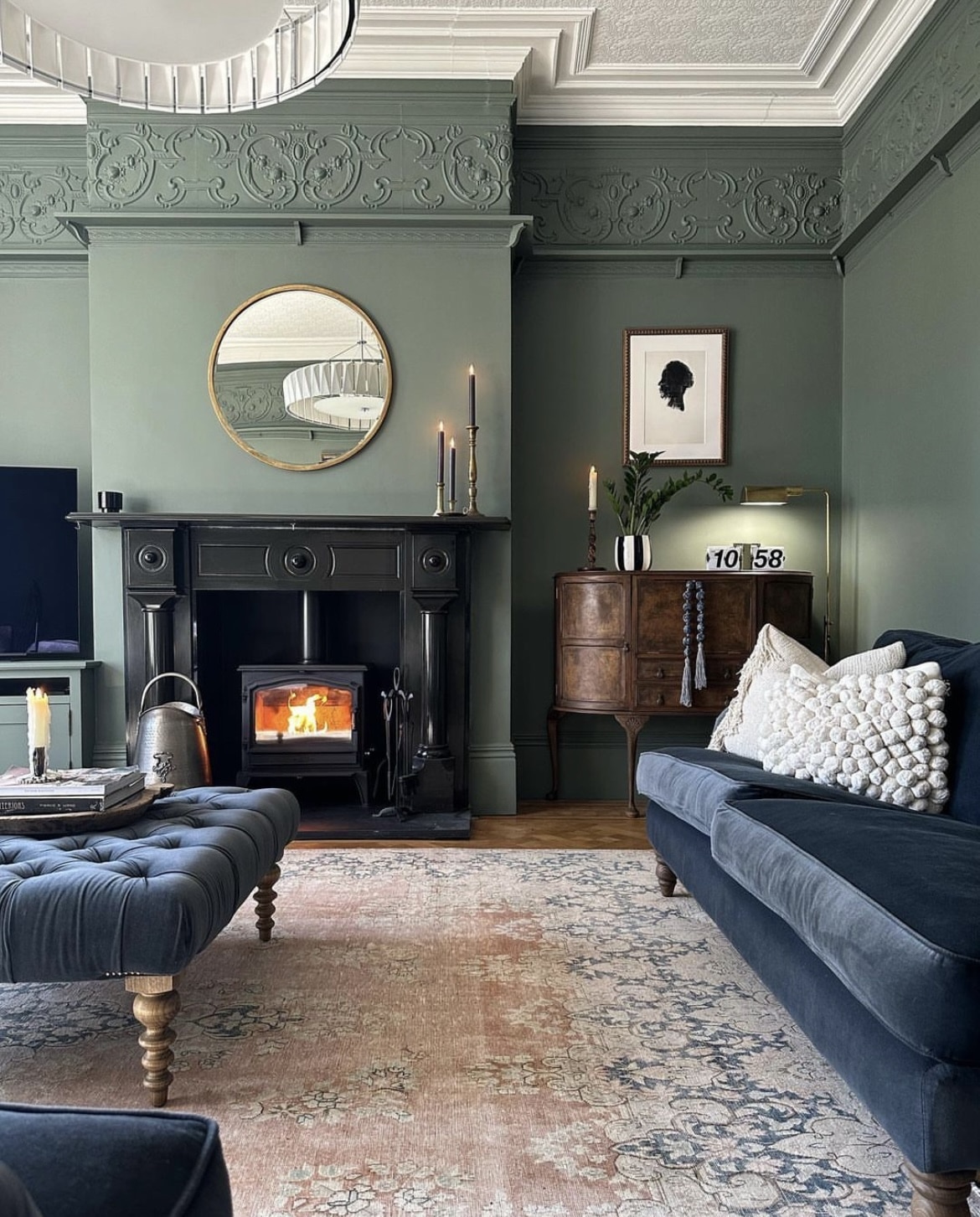
Greens have become increasingly popular in recent years, especially for living rooms. Whether you opt for a sage green or a deeper shade, it delivers a restorative, soothing feel which looks great with so many different colours.
Green Smoke is a popular green shade, it’s defining without being too dark and overpowering. Lighten things up with a bright white ceiling, it will draw the eye up too – giving the illusion of a bigger space.

6. Back To Black
Black spaces don’t have to be gothic or oppressive, they can deliver that perfect level of cosiness that other colours can’t achieve. Have I changed your opinion on it yet?
Pitch Black is used here across the walls, whilst the white ceiling keeps things from feeling too enclosed in the space. The key is to intersperse those lighter, brighter colours as demonstrated with the mantlepiece and flooring.
Introduce other moodier colours such as a dark green velvet sofa, the different texture brings depth and warmth into an all black space.

7. Two Tone Painted Wall For Big Impact
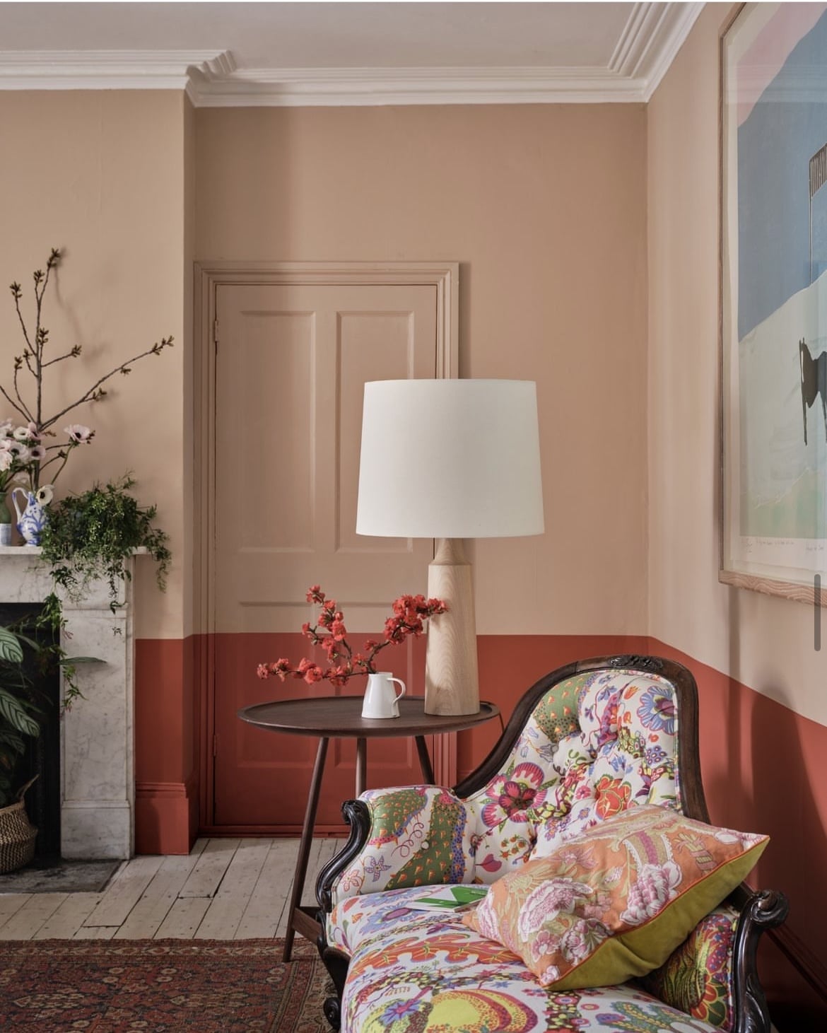
Think outside of the box when it comes to using paint in a living room. Farrow and Ball perfectly demonstrate how good a two tone painted living room can look with Templeton Pink and Bamboozle.
You can achieve this look with any other colours, just make sure that one of the colours is more deeper, darker or defining than the other, and it will create the desired, complementary contrast.

8. Add A Splash of Heritage Yellow
Yellow for a living room, really? Heritage Yellow is growing in popularity, it’s a more modern and mature take on what we consider a traditional yellow.
India Yellow brings a touch of masculinity and funnily enough, a great colour to work with. It pairs beautifully with dark accents and earthy colours, make like this interior designer by using it on a feature wall and to zone certain areas in the room.

9. Rusty Reds Are On Trend
According to interior designers, reds are making a return, and earthier, redder shades are going to be in over the coming year.
Red Earth is a gorgeously sumptuous shade with red and yellow pigments which give it that earthy, rustic terracotta feel.
Do layer with other sumptuous colours in the space such as navy blue for added warmth.

10. Indulgently Brown
On the lines of rich, sumptuous colours we have brown which is having a huge comeback. Using London Clay, this rich shade sets the tone for this room, layered with bold colours for a warm, cosy feel.
Find brown a bit daunting to pair with other colours? Cathy Dean, Interior Designer at Studio Dean shared her thoughts on pairing colours with brown, “Don’t go too stark and try to contrast with brown. Take things slowly and layer up and down through the palette you have selected, it is a colour that likes to be understated and simple. Hold all of the colours together and make sure it has the same undertone”.

11. Pair Soft Tones of Pink With Black For Definition
Sulking Room Pink is a notoriously popular shade for an interior, it’s not too delicate for a pink, but brings a beautiful rosy pop of colour to a living room.
Pairing with a black accent creates a beautifully defined colour scheme, you just need to add a few well placed black items through to give the desired look, and pull the room together.
Which of these colour schemes is your favourite? Do you lean towards neutrals or bold colours? Do let me know in the comments below!


Love the greens. Trying to choose a colour to math seagrass tiles a blue green for my kitchen.