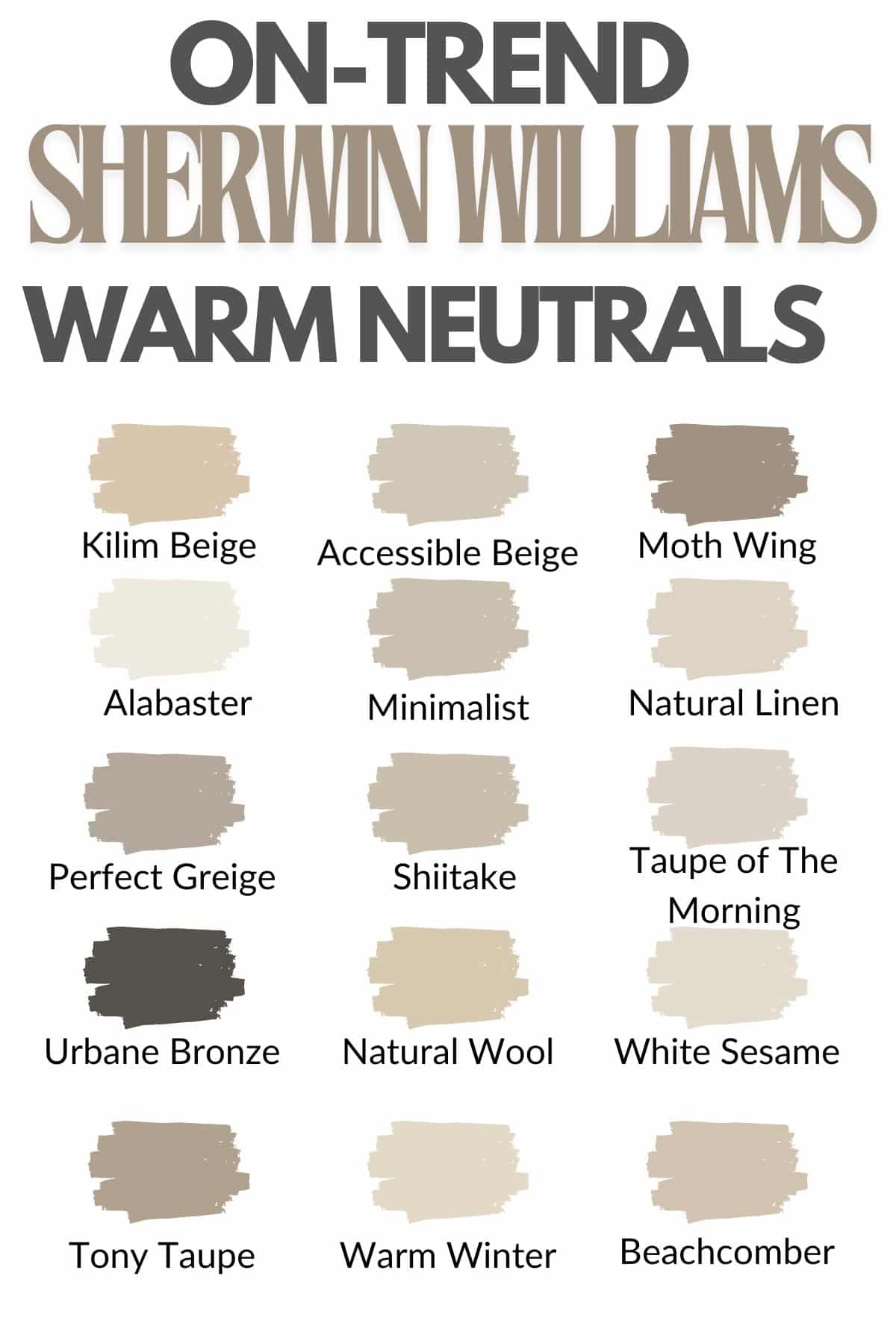
I’ve spoken a lot about the trending colors for 2024, and that lean towards warmer, richer neutrals is evident.
There’s a move away from grays and plain beiges, with warm taupes, browns and red based whites taking centre stage. Warm neutrals tend to be well suited to spaces, no matter the orientation too.
Moreover, they provide the perfect foundational color, ready to build with other warm colors and textures in your room. Here is my pick of the most on-trend Sherwin Williams warm neutrals for 2024 that will make your home feel fabulous, and cozy. I’ll also be sharing my top tips on what spaces they are well suited to, as well as the best complementary colors.
15 On-trend Sherwin Williams Warm Neutrals For 2024
1.Kilim Beige
Kilim beige is one of the most popular Sherwin Williams colors, and you can see why. This warm based neutral is part of the orange family and brings a soft warmness without it having a strong yellow undertone which can be common with warm whites and beiges.
This warm neutral is the perfect color for creating a cozy feel in any room. I particularly like it in living rooms and entryways. Pair with other neutrals for a relaxed, yet stylish color scheme. Alternatively, create a coastal feel by incorporating a striking shade such as Storm Cloud.

2. Accessible Beige
Beige tends to carry a yellow undertone, and perhaps this is what makes accessible beige so popular is because instead it has undertones of gray.
Despite it having a cool undertone, this color gives your space a warm, snug feel. I adore how this neutral feels in a space, and it looks beautiful on trim and doors as shown in the photo below. Pair with a warm white such as Alabaster for a gorgeous combination.
Pair with neutral or earthy tones, this color is ideal for farmhouse, modern rustic and coastal styled interiors.

3. Moth Wing
Warm, richer colors are at the heart of trending colors this year, and if you’re looking for something a tad darker and a bit more decadent, Moth Wing is a beautiful choice.
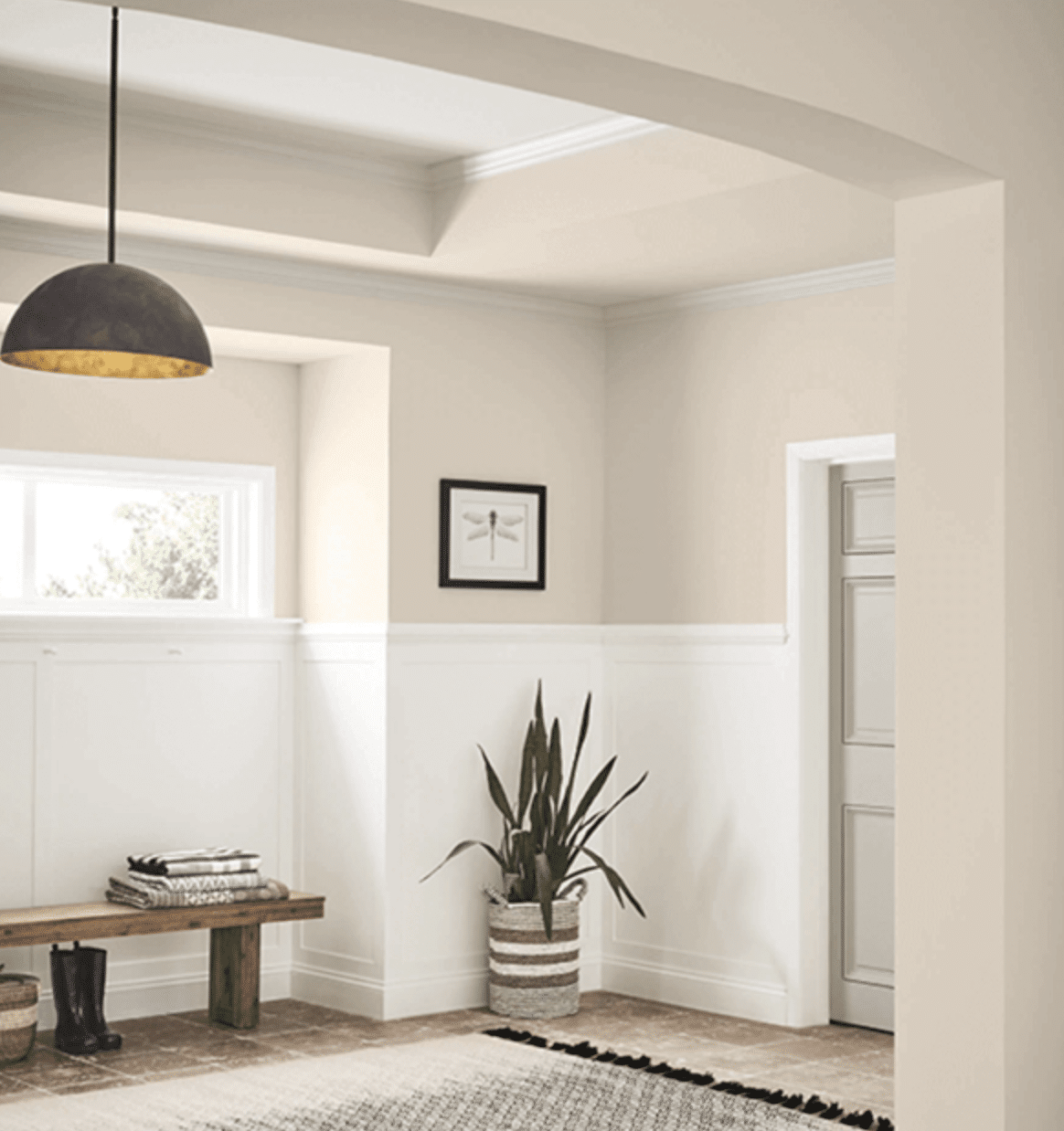
This warm medium beige has gray undertones and provides the perfect grounding color in a space, it works great on half wall panelling as shown below with a warmer white above it.
Lean into this color fully by color drenching for a super cozy effect in spaces like a cinema room. In other spaces, use it on accent walls to avoid the room feeling oppressive.

4. Alabaster
It’s easy to see why this is one of the most popular warm neutrals in the collection. It brings the brightness of white whilst not feeling clinical and uncomfortable in a space. It has the lightness of white but brings a soft, warm coziness that makes it the perfect warm white throughout a house.
Introduce other warm neutrals to your trim and woodwork to add definition. Opt for colors two shades darker for your trim, accessible beige is a great pairing.

5. Minimalist
For me, Minimalist is just the most perfect warm neutral for 2024. It has warm undertones and delivers a cocooning shade to your interior, a welcoming shade for an entryway or a cozy color for a lounge.
Set your color scheme off with some well placed black accents, they will pull the color scheme together and deliver a gorgeous spot of definition. Use black through hardware, photo frames or decorative accessories.

6. Natural Linen
This is further proof that neutrals can have greige undertones and they still deliver a warm feel to a space. This light warm neutral is ultra relaxed and stylish.
It pairs well with light, earthy and wooden tones. Or, pair with a bright white on panelling as demonstrated for a breezy feel.

7. Perfect Greige
This mid-tone gray has red undertones which balance beautifully for a warm neutral color. It has an almost mushroom, taupe quality to it which delivers a touch more definition than lighter neutrals.
Pair with other neutrals, an earthy color scheme or add bright whites and black for a relaxed farmhouse feel.

8. Shiitake
Add a warm touch of elegance to any room with this warm stone gray. This shade has a gorgeous sandy feel to it, it reminds me of my favorite Farrow and Ball shade, Oxford Stone!
It has a deep richness to it, and I love it for bedrooms or cozy living room nooks. It pairs equally well with bolder colors as it does with earthy neutrals.

9. Taupe of The Morning
This is a classic taupe that brings a lightness and warmth to a room. If you’re not a fan of yellow based whites and beiges, this grey based taupe is a wonderful alternative.
It virtually goes with every color and looks great in a farmhouse, coastal or even traditional inspired interior design scheme.

10. Urbane Bronze
Despite its dark demeanour, Urbane Bronze is still considered a warm neutral and really reinforces that lean into richer neutrals this year.
Rooted in nature, this brownish gray is soft and subtle and provides the perfect alternative to a black or charcoal gray, whilst still delivering warmth and definition to a room.
Take inspiration from the below and paint an accent wall in your room or even a wall in an entryway to draw the eye in.

11. Natural Wool
A warm, based yellow neutral. If you like yellow undertones, this cheery natural wool delivers a warm demeanour whilst not being overtly yellow in tone like a traditional magnolia.
It adds instant warmth to a color scheme, best in smaller rooms such as bedrooms and living rooms.

12. White Sesame
Sherwin-Williams’ White Sesame is a warm neutral shade that brings a subtle, inviting warmth to any space.
Its soft beige undertones create a cozy and versatile backdrop, perfect for complementing a wide range of decor styles and color palettes.

13. Tony Taupe
How gorgeous does Tony taupe look on this built in pictured below?
This earthy taupe neutral is warmed by notes of a mushroom undertone. Partners beautifully with wood as shown, or with earthy colors such as browns, creams, whites and greens.

14. Warm Winter
Another yellow based warm neutral that will bring instant warmth and impact to your room. It leans slightly more on the magnolia side of things but looks great in a modern rustic or coastal inspired color scheme.
Don’t forget those defining black accents to help ground your color scheme.

15. Beachcomber
Finally, we have beachcomber, another favourite of mine. This gorgeous sandy neutral is a versatile, warm neutral that can be used in virtually any room.
It pairs beautifully with most colors, working well in earthy, neutral and costal inspired schemes.
Paint colors can look vastly different from one house to another due to light, so I always recommend grabbing a tester pot of a few of your favorite shades and sitting with them in your chosen space so you can see how the light affects them during the course of a day.
Have any questions about specific Sherwin Williams colors or what to pair them with? Please leave me a comment below and I will share my recommendations with you and the community.


I have cream kitchen cabinets and a lighter cream/ white trim. I don’t like the yellow undertones. What warm neutral
will help balance the yellow undertones and not make them seem so yellow.
Morning! I would opt for a neutral with a grey undertone, this will balance the warmth of the yellow. I’d look at shades such as Alabaster, natural linen or white sesame. It will of course depend on the orientation of your room how they look, so I would recommend grabbing a couple tester pots and painting an A4 sheet of paper, then taking it around the room to see how it pairs with the cabinets and light in your kitchen. Hope that helps, Nicole x
I’m remodeling and I’m getting a much larger kitchen and opening up our living room space. Will Alabaster be a good all through the kitchen and living room with ALL trim including doors in Accessible Beige or should I opt for different color schemes for each room? My kitchen cabinets are black walnut.
Morning! If you have an open plan space from the kitchen into living room, YES – keep these the same. If they are completely separate rooms, I would lean into a different color scheme for each if you can, there’s nothing wrong with keeping them the same, but it will add extra visual interest and depth in colors between the two spaces 🙂 As for alabaster and accessible beige on trim and woodwork, YES, one of my favourite color pairings!
Hi, we are building a modern farmhouse and I’m in between alabaster and Soji white for the allover color… I feel that Sohji White is too tan so what trim color would you recommend for Alabaster? Thank you!
Morning! Ideally something 2 shades darker so you have lovely definition, either Agreeable Gray or Egret White would be perfect, thanks!
I have shiitake painted in a downstairs bathroom and on the backsplash of the kitchen with cabinets painted in divine white. Trying to come up with a lighter color for the walls in the kitchen that will coordinate with shiitake and divine white that is a little brighter yet still warm. Any suggestions?
Morning, one shade darker than Shiitake is Stone Lion and this will co-ordinate with the scheme perfectly, if this feels a little too dark though, have a look at Kilim Beige or Antler Velvet, Nicole x
Hello we are painting most of our common living g space White Sesame walls and alabaster trims and doors. I’m having a hard time choosing what color to paint our kitchen cabinets since we have an open concept. I’m also at a loss when it comes to curtains I know I would like light linen color as I have lived with bright blues for the last 10 years and I’m craving more neutrals . We have white oak floors and have recently painted our front room turned music room a dusty blue and we are using gold accents. Any suggestions would be greatly appreciated
Good morning, sounds like a perfect combination of shades. From the types of colours you have suggested, it sounds like you might like an earthy inspired scheme, using natural colours – I would stick with oat, or cashmere colored curtains and bring some colour in through your cabinets. Would you be open to greens, browns or blues? Let me know if there is a specific shade you are drawn to and I can send you some paint suggestions. Thanks, Nicole
We are wanting to paint out all the wood in the built ins and wainscoting. Also doing the bricks and wall colour. I don’t want white, would like to keep it warm. Maybe doing the wood in a light mushroom colour. We are thinking of staining the mantal and counter top section of the built ins in a darker brown family. Any thoughts are appreciated!
Morning! Whatever paint color you end up using on the built ins, ideally go for something at least 2 shades darker on the bricks, it will keep the space feeling cohesive whilst it just brings a tad of definition and depth to the bricks. A couple of potential suggestions – Minimalist on the brickwork and Sunbleached on the built ins OR aesthetic white on the built ins and shiitake on the brickwork. I hope this gives you an idea of the subtle difference in shades I would lean into for something like this. A darker stain on top of the mantel will add beautiful definition against these warmer neutrals. Hope that helps! Nicole
Thank you! We ended up doing Taupe of the Morning on all of the wood and High Sierra on the fireplace. Still some work to go, but it is looking beautiful!
Looks great!!