
Say hello to the new honey of our interiors, ‘butter yellow’. The most delicious, uplifting shade of yellow that will make you wonder why you never considered it for your home before.
Josephine Jenno Founder of Casa by Josephine Jenno adds, “The humble butter yellow is experiencing a delicious revival in interiors this season, spreading warmth across design-forward homes with its understated optimism”.
It’s the new color to try in your interiors this spring/summer season, one that can be enjoyed as a new lick of paint on your walls or by adding a golden touch on your dresser. Here’s everything you need to know about this color of the moment.
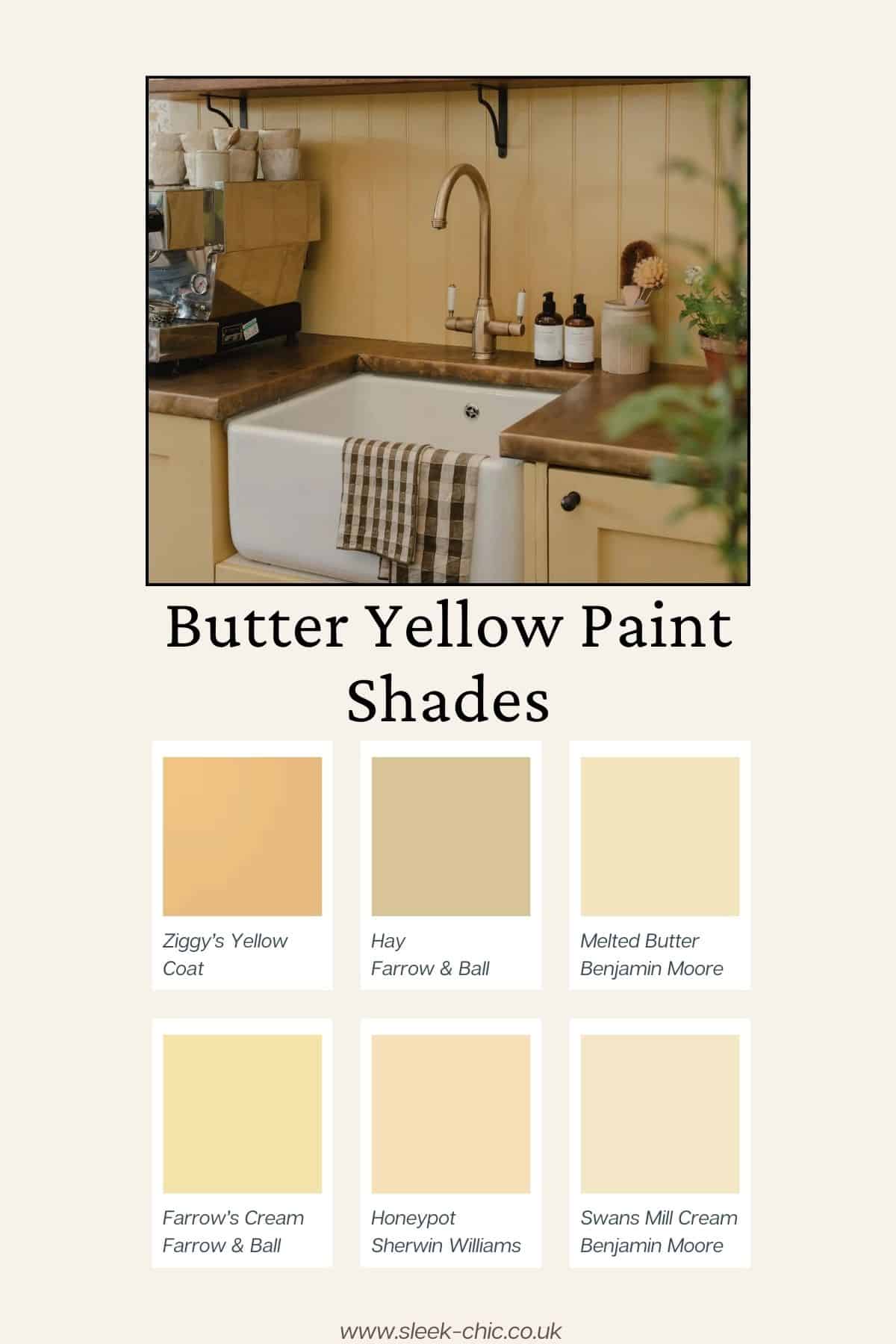
Buttery Yellow Paint Shades
Coat your walls or furniture in the color of the season for a warm, uplifting feel.
These soft buttery tones are so versatile that they can almost be classed as a neutral as they pair so well with natural colors and materials as well as bolder shades if you wish to go down that route.
Here are some of the best buttery yellow shades to add to your shopping list.
- Ziggy’s Yellow – Coat
- Hay – Farrow and Ball
- Melted Butter – Benjamin Moore
- Farrow’s Cream – Farrow and Ball
- Honeypot – Sherwin Williams
- Swans Mill Cream – Benjamin Moore
What Colors Pair Well With Butter Yellow?
The beauty of a butter yellow shade is that it’s a hue that spreads (excuse the pun) almost perfectly in any room, no matter the orientation of the space. It will lift cold, north facing rooms and help to balance and add softness in a sunny south facing room.
It so versatile that it can almost be classed as a neutral of the interior world, so virtually pairs well with any color you can think of.
“It’s a color that shifts beautifully throughout the day, appearing rich and golden in morning light, then mellowing to a sophisticated neutral by evening.” Says Josephine Jenno Founder of casa by Josephine Jenno.
“The versatile shade pairs effortlessly with natural materials—think pale oak, rattan, and matte ceramics—while providing the perfect backdrop for the season’s botanical influences”.
The earthy inspired design trend is a big one for 2025, and this color slots into that design scheme ideally. Try pairing with soft greens, natural materials, warm creams and taupes.
If you want something a little punchier, it’s a match made in heaven for a spicy red. Yes, it plays perfectly on the ‘unexpected red theory’ which claims that a pop of red is the only finishing touch you need to pull a rooms scheme together, but it does balance particularly well with a yellow, when used in small doses.
If perhaps you want a more whimsical, spring like feel, lean into soft hues of your favourite colors to pull it together. Cornflower blue, soft lilacs, blush pink and soft creams.
Josephine added, “After years of cool grays and sterile whites, this warm neutral offers precisely the ingredient our homes have been craving”.
How To Follow The Trend In Your Interiors
According to Google search data, searches for butter yellow are soaring by 151%, it’s a trend that many homeowners are eager to try in their own home, but it doesn’t necessarily mean having to repaint your walls to get onboard with this trend.
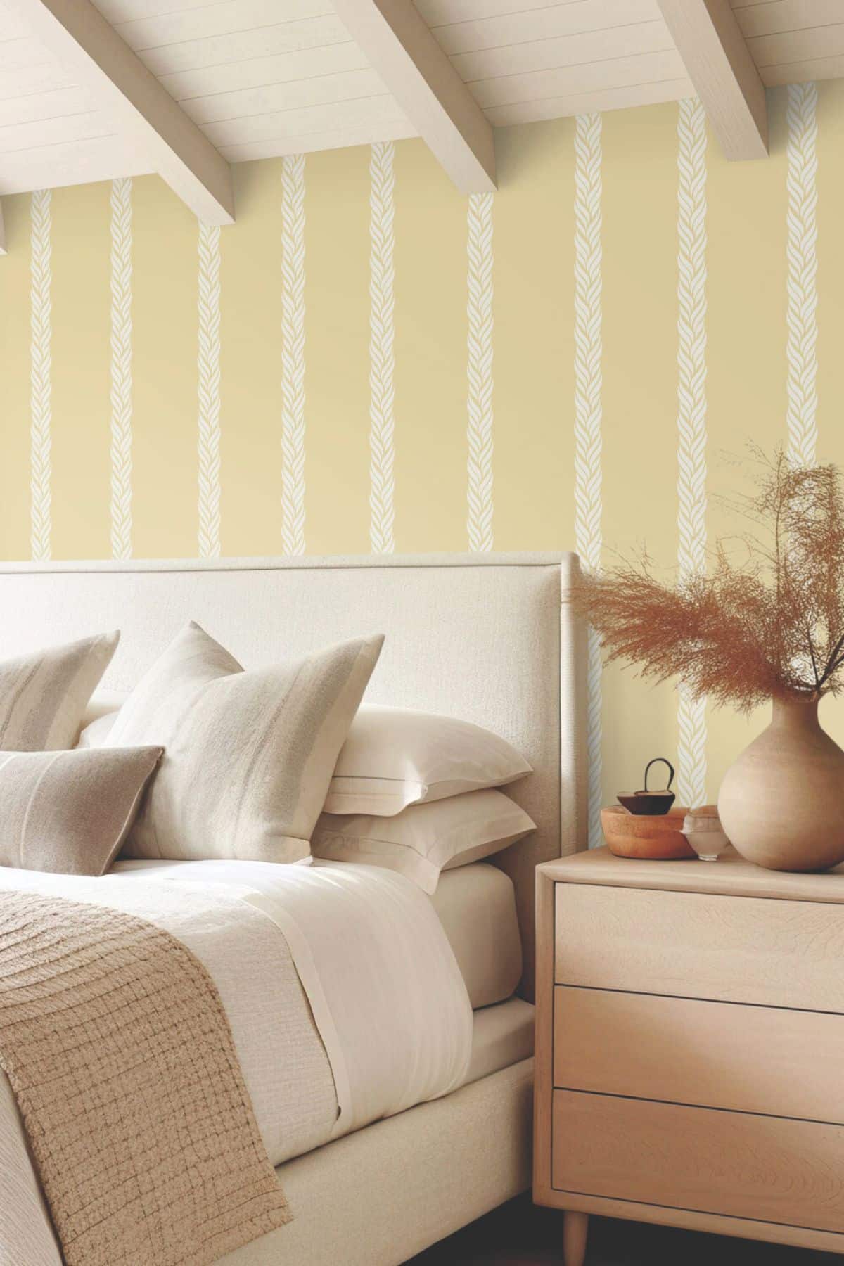
Whilst wallpaper can be totally subjective, it’s considered artwork in its own right and can deliver a stylish, elevated look to any room.
A stripe is a timeless classic pattern to go for, and with no sign of butter yellow dropping off the radar just yet, wallpaper is a great way to get onboard with this trend in a bedroom, living room or hallway for a welcoming entrance.
If you’re looking for a quick and rather inexpensive way to update an interior, paint remains one of the best ways to do it. A fresh, butter yellow will transform a space, injecting warmth and personality.
Shown below is Ziggy’s Yellow by Coat, a light to mid tone yellow that just feels good to be surrounded by.
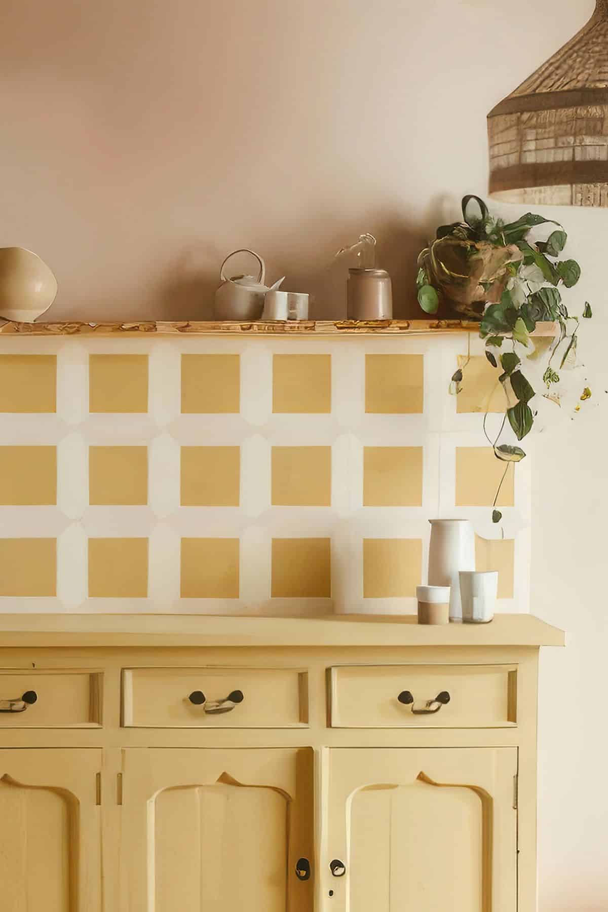
I personally think a butter yellow would look beautiful drenched on a bathroom vanity, a child’s dresser or a set of wardrobes. A fun way to breathe some life into tired furniture, but it brings a fun accent to a room that can easily be updated when you want to try another color.
The right shade of butter yellow will feel like an elevated, modern neutral. It’s bright and breezy without feeling clinical like a bright white, or too yellow that it’s considered to be magnolia. Drench it in a room on the woodwork, walls and ceiling for a cosier feel.
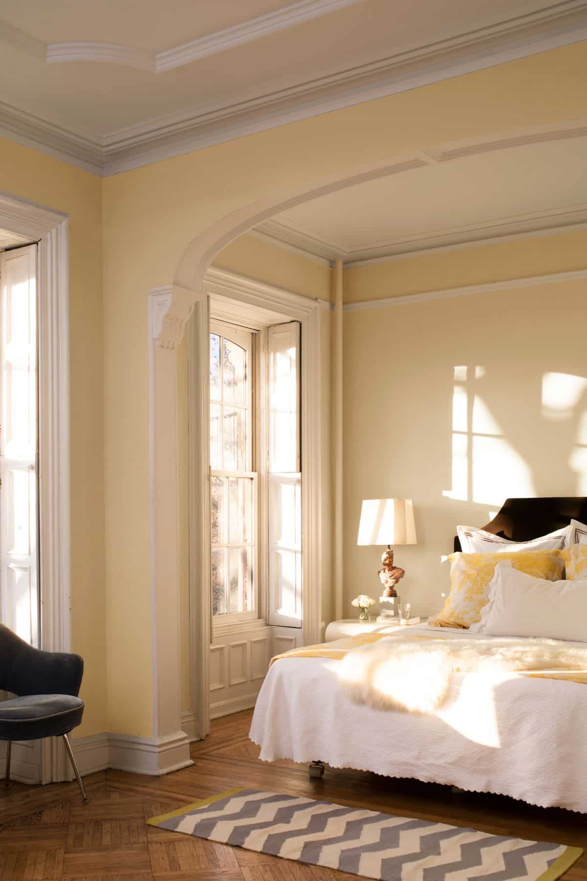
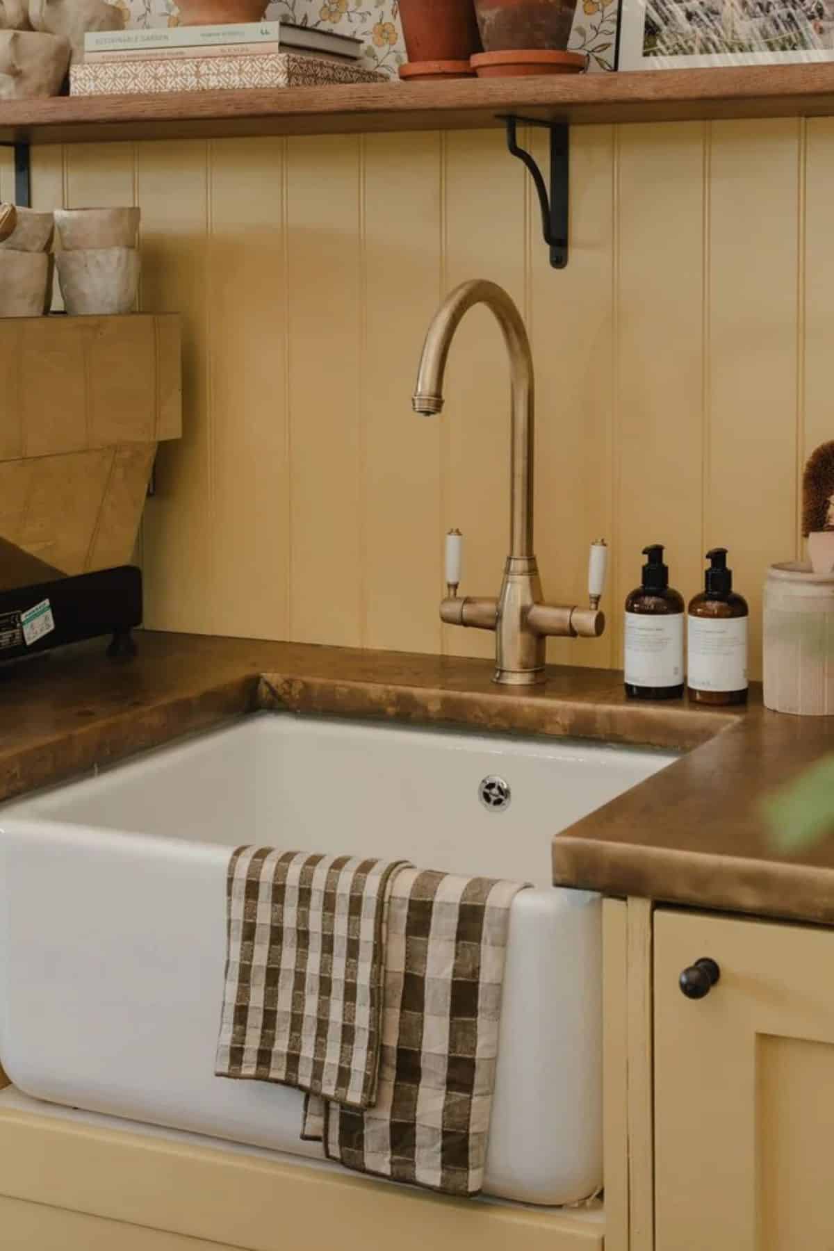
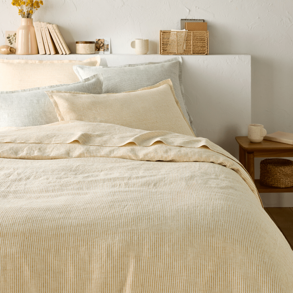
It works particularly well with natural materials in a scheme such as wooden tones and antique pieces like shown in the bedroom below. It feels nostalgic, and the wooden tones help to ground the scheme without overpowering the softness of the yellow.
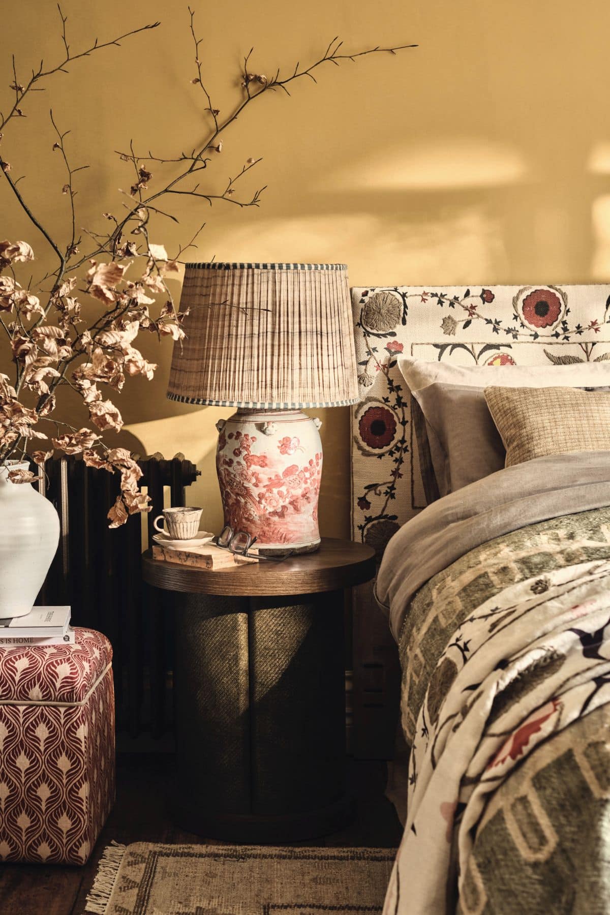
Using yellow on your walls doesn’t mean you can’t incorporate other bolder, rich shades into the mix. Rich, bolder shades are totally on the bingo decorating card for 2025.
Take note of the below earthy designed bedroom with rich reds, greens, creams and most importantly, plenty of tactile elements to pull from that create such a well engineered, and cosy space.
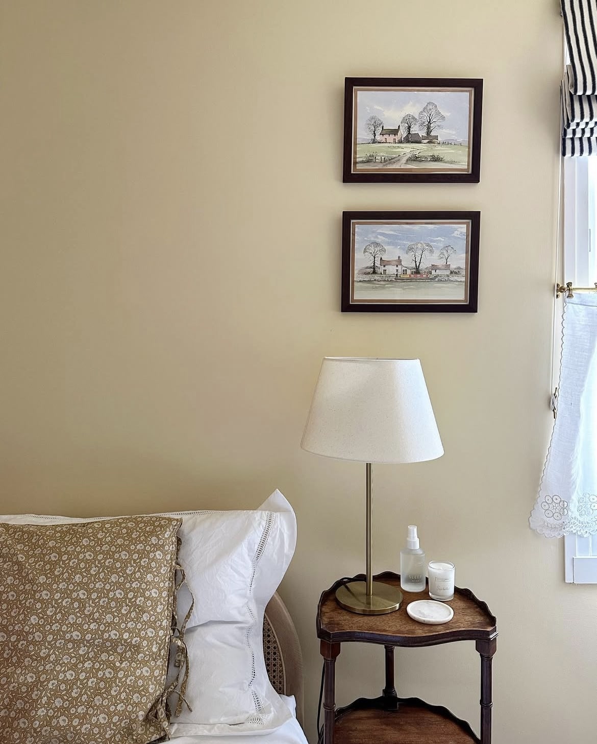
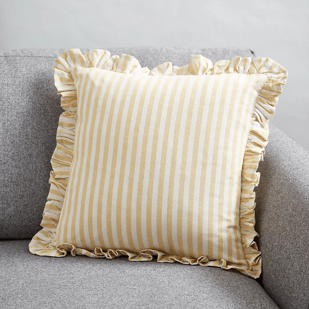
If you’re looking for something less temporary in your commitment to trying this color, butter yellow bedding, textiles and decor accessories are a beautiful way to try this trend, and it’s the perfect way to refresh your bedroom or living room scheme.
Team with soft creams for the most perfect spring time look that’s on trend and feels good to be around.
Hello, I reached out to you on YouTube, Dean that we had a southwest facing kitchen that opens up directly into the dining room and living room. So when you are standing at the front door and walk inside, you see the kitchen, dining room and living room all in one I would like some paint ideas, is there a way I could send you a few pictures or could you give me a few ideas of a beautiful farm inspired kitchen? I do not want anything dark but I prefer not to have dark white or any gray.
Also, the large living room is northeast facing and the kitchen (in this picture) is south west facing. The dining room doesn’t have a window but has east and south light. It’s the dark green wall in the picture. Any beautiful neutral type of color help would be so appreciated. It’s our great grandmothers farm house we just put an addition onto. Thank you and adore your content!
Morning! WOW! What a space, it’s going to look incredible, and you’ve got the best of both worlds with where the light is coming into the open plan space. For Farrow and Ball shades – I’m thinking of something like Joa’s White, Dimity or White Tie for a warm yet light feel throughout – if you’re looking at another paint brand, let me know and i can send some recommendations for those too! Nicole x
Thank you so much! What about any Benjamin Moore Paint colors suggestions? I feel like the dining room could possibly use a little warmer or accent color in there it’s where it goes darker under the arches.
Morning! Hmm this is a tricky one, typically with an open plan space i suggest using the same color through for a cohesive feel, so in this situation, if you want a different color under the arch i would go for something that is just about two shades darker than the other color so there is warmth and interest but they’re part of the same color family. For Benjamin Moore shades, have a look at Swiss Coffee, Pale Oak and Classic Gray – based on what you choose i could suggest a complementary colour under the arch 🙂
The dining room is where the door and dark green wall is. Also wouldn’t it be pretty to highlight the curved arches with a cozy or moody color? Just not interested in reds or oranges.