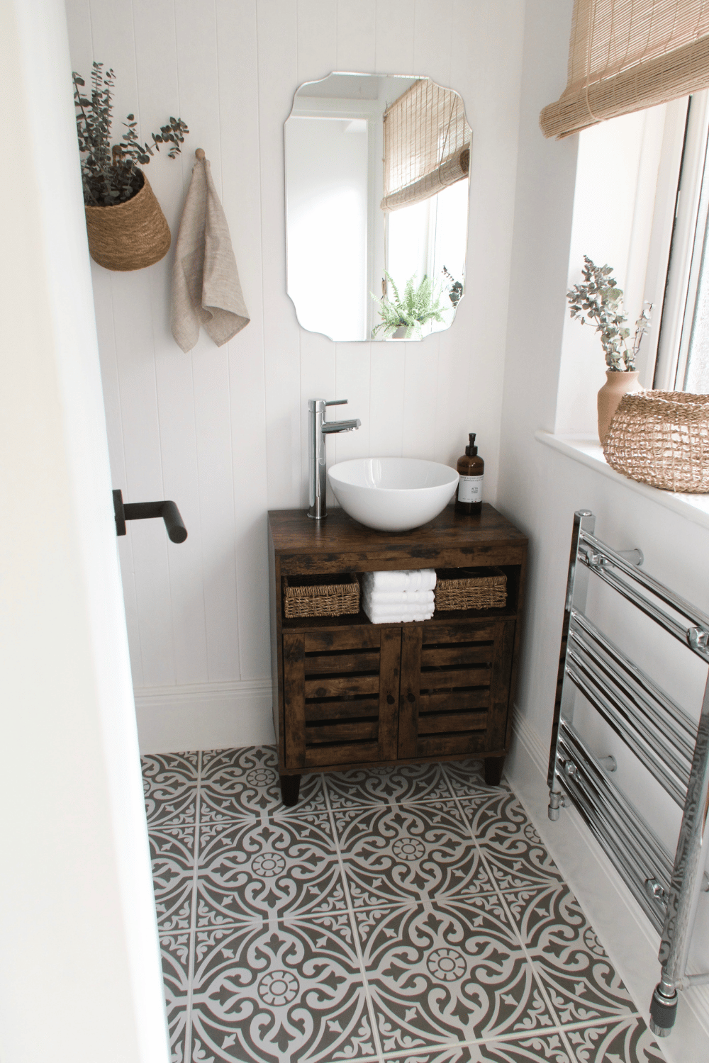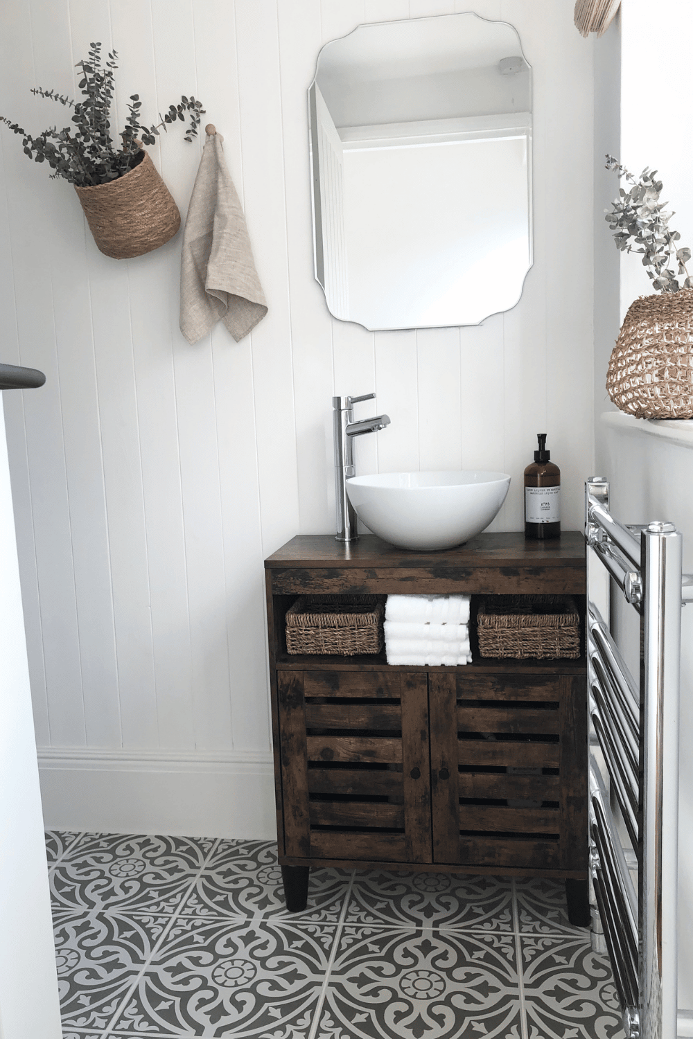
I am so excited to reveal our first finished room in the new house, which was the complete renovation of our Victorian bathroom. When we moved in, we knew this was the very first room that had to be tackled as it genuinely wasn’t a usable space. The door opened straight onto a sink with about a 2mm gap to get in, the toilet was situated in the middle of the room, and half of the room was taken up with the longest bath I have ever seen, I know I’m only short, but I could lie flat in it!
The placement of units in the bathroom was the biggest downfall, and it was the coldest room in the house with no heating, except a little heater stuck to the wall with a pull cord. The sink was HUGE and placed directly in front of the window so there was no option for a mirror. The floor was lined with a cheap Lino that you’d see in a warehouse. Oh, and the shower? Yeah, that didn’t work, but there were the pipes you could put onto the end of the taps for a makeshift shower!
The Before
As you can see from a selection of mine and estate agent photos, you could literally do everything within a 20cm radius in this Victorian bathroom, so poorly configured and the cheapest units. If you wanted to sit on the toilet with the lid down the plastic seat would drop in on itself, what a quirk?


Reconfiguring The Space
Interiors are incredibly important, but actually reconfiguring the space took precedence as it needed to work much better than the existing setup, and actually be nice to use. That would help. It can be costly moving pipe work but it was absolutely essential, as our bathroom is on the ground floor (very typical with some Victorian terrace houses with extension) it would involve channelling into concrete which is extra work, and MESS.
I LOVE a bath, and when I was looking at my first flat 5 years ago, I was adamant I would never buy a place without a bath. So, here we are ripping the bath out for good, but it was the only way to make this space usable, and spacious. As it didn’t have a bath, we needed to make sure we fitted a really luxurious shower with a large shower head to make up for this. We would then move the toilet next to the shower, where the bath would have previously taken up all the space, the sink unit could then be moved away from the window into the corner, and a heated towel rail to be added underneath the window space. This wouldn’t be enough to heat the whole room, but perfect for warming towels.
Without using CAD software or interior designers it can be a little bit nerve wracking designing your own bathroom layout and hoping it’s going to work, with no way of knowing how it will impact the space in the new bathroom. Space was a big thing for us as we wanted the space to work better, and appear more spacious than it was.
Interior Design
I’d already designed a bathroom moodboard for the first property we were buying which fell through, but the style was completely different and it just wouldn’t have worked for this space. Creating a moodboard for every single room is the only way you can be certain that the elements, colours, fabrics/tiles will all work in harmony together. It’s the first step that any interior designers make when putting ideas forward to a client, and it works. I was able to keep playing around with finishes and decide on the style. This style needs to flow throughout the rest of the house as standard and I went for a farmhouse, Hamptons Coastal, boho feel. There is pattern that comes from the tiles, but the rest is ultra relaxed with white shiplap/T&G panelling, and lots of naturals in the way of seagrass and rattan.
Again, I had no idea whether the bathroom would be able to pull off this style, especially the patterned tiles I had selected. As you can see from my moodboard below, I have pretty much incorporated all of this into the bathroom, and I can’t quite believe how beautiful it is. It worked.

The After
I cannot tell you how happy we both are with the finish of the bathroom, it has come out exactly as we visioned and it looks like a completely different house. It’s crazy how the reconfiguration of the bathroom has made It feel so much bigger and spacious, it’s all about making the space work smarter, especially when it’s small to begin with.
We had to also opt for the slimmest sink unit we could find as anything bigger would have totally encroached into the room. It was a mad panic finding this as we were originally going to upcycle a unit and then put the sink bowl on top, but literally nothing was coming up on Facebook Marketplace that was the right size. I found this sink unit on Amazon in the end, and it was way too short, but with some longer legs it’s absolutely the right size for this bathroom space now.

Despite being a Victorian property, most of those architectural details had been removed, and with the Victorian bathroom being part of an extension post Victorian times, this wasn’t the right home to keep things traditional. Whilst we are restoring some Victorian details throughout the house, this farmhouse, ultra stylish and relaxed design will be filtered throughout the rest of the house. I just love these earthy neutrals, rattan and focus on natural materials.
The Victorian bathroom didn’t previously have skirting, but as we were fitting shiplap the skirting would perfectly tidy up the edges, whilst I think it adds some stylish luxury to the space. In fact, we had to reskirt the entire house. The house had thin skirting which was all painted dark grey and had sockets on it throughout the house. It was so grim, old and dated that it was the first thing we ripped out. I literally have nightmares thinking of that grey that ran throughout the entire house.

My first port of call was Skirting World who have such a huge selection of skirting styles and architraves. We opted for the Georgian MDF Skirting as I love the height and detail of it, whilst it elongates the room, adding a little bit of luxury to the space. We have now kept all the skirting white, and I can’t tell you the difference it has made (more reveals coming on this). It looks beautiful in the bathroom, and Skirting World were such a dream to deal with from the point of order, and we’ll definitely be using them in the future for our skirting and architrave needs in properties.

From moodboard to execution, we are obsessed with our first finished room in the house. A new bathroom can be costly, but huge, special thanks to my amazing partner who can do most trades, I’m not the best labourer, but I am a mean painter! We are getting there with the rest of the rooms in the house, but it’s mostly down to interior styling now. There’s been a LOT of dust, sweat and fun, but it’s so worth it when you see the end result.

All details from the bathroom where possible are tagged below;
Vintage Bevelled Edge Mirror – Dunelm
Linen Guest Towels – LinenMe
Floor Tiles – Topps Tiles (currently sold out)
Concrete Plant Pot – Cotswold Trading
Sink Unit Baskets – eBay
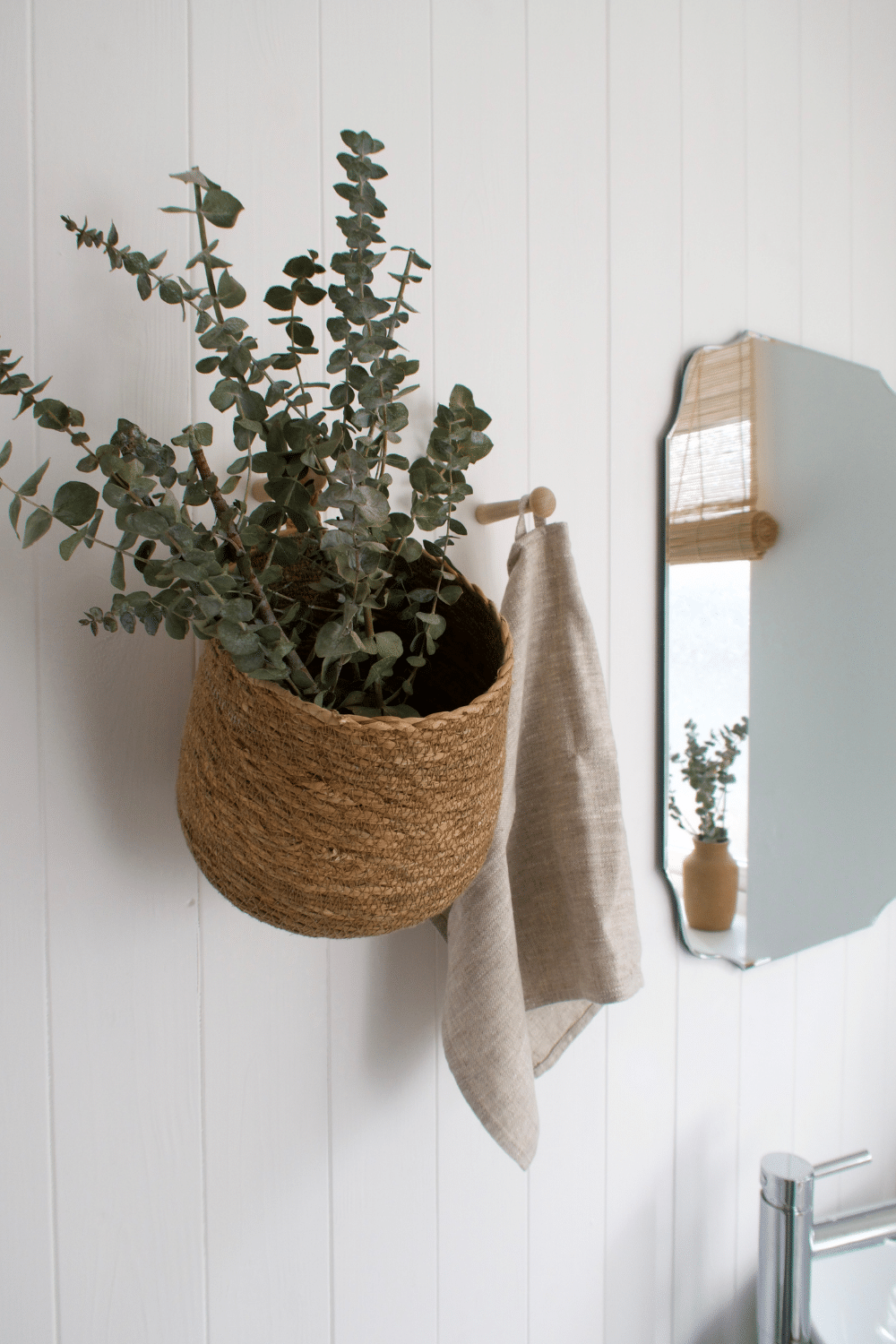
Hanging Basket – Trouva
Dried Eucalyptus – Etsy
Shelf Mendi Basket – Nkuku
Terracota Vase – Nkuku
Bamboo Blind – B&Q


