If you have a dedicated utility room in your home, decorating them tastefully can be a great way to transform the mundane and make laundry and chores, somewhat of a more enjoyable experience.
Be it a small or large space, we’ve compiled a list of some of the best Farrow and Ball utility rooms in real homes to give you an idea of how you can update your space.
13 Farrow and Ball Utility Room Ideas That Will Make You Want To Redecorate
1.Use Olive Green For An Earthy Feel
Olive green is one of those unsuspecting colours that can totally transform a space.
There’s something quite rich and sumptuous about how it looks in this utility room, with brass and black accents for warmth and definition.
I would always recommend going for a different colour in your utility room to that of your kitchen for greater visual interest and contrast between the rooms.
F&B Shade used: Bancha

2. Pink Is Always A Good Idea
Not considered pink for a utility room? This might change your mind!
Sulking Room Pink is an enduringly popular pink shade from F&B, yet not overly feminine and a gorgeous mature finish to it. It looks beautiful contrasting against a New White backdrop like this.
F&B Shades used: Sulking Room Pink on the cabinetry and New White on the walls

3. Keep Things Light & Bright
There’s a lot to be said for just sticking to a neutral colour scheme for a light and bright approach in a utility room.
If you have a very small space or a room with no windows, a warm modern neutral like Pointing and White Tie will help to keep things airy but inviting.
F&B Shades used: Pointing on the walls and White Tie on the cabinetry

4. Elevate With Tongue & Groove
Even small utility rooms can feel like a total luxury, and I adore the use of tongue and groove panelling used behind the sink here.
A good bit of T&G can totally transform an empty wall with depth and character. French Gray has been used here for a lovely touch of warmth, pair with brass accents for added warmth and visual interest.
F&B Shade used: French Gray

5. Introduce A Touch of Sunshine
Straw is part of Farrow and Ball’s archive collection of colours, but a real beauty in a setting like this.
A beautiful choice for a utility room that receives little natural light as it will bring warmth and depth to the room. Keep your cabinetry colour fairly neutral so Straw can do the talking.
F&B Shade used: Straw

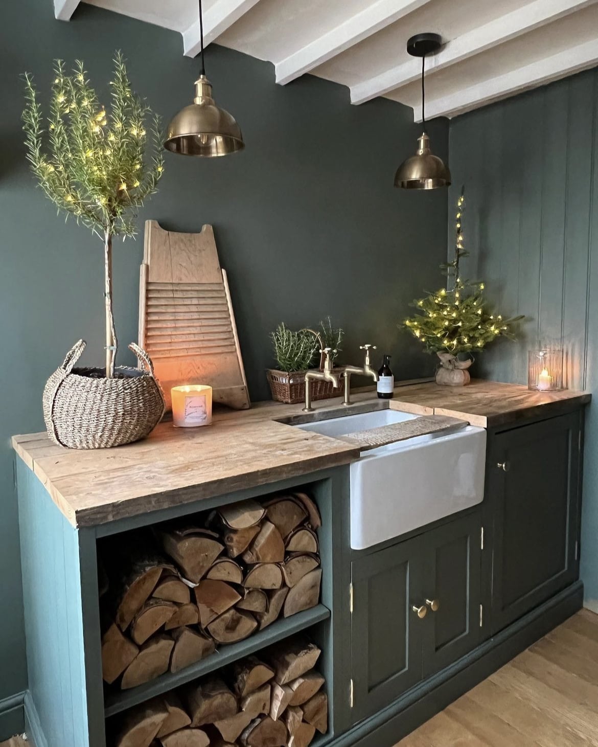
6. Explore A Moody Paint Palette
It can feel daunting to opt for moodier colours in a space, but there’s something quite sultry and defining about using darker colours in a utility, such as Downpipe.
This shade was made for pairing with brass hardware details, it brings warmth and a touch of luxe to the cabinetry.
F&B Shade used: Downpipe

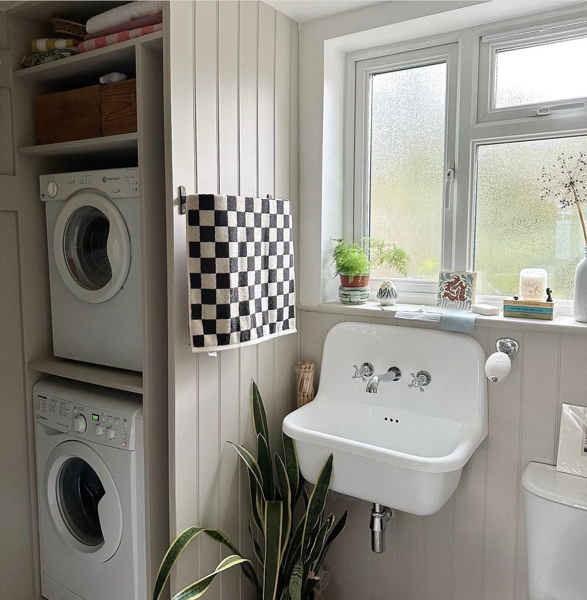
7. A Warm, Modern Neutral
If you’re looking for a versatile neutral, Elephant’s Breath is a great choice. It’s not clinical like a bright white and is warm and inviting in nature.
I love the addition of the black and white chequered hand towel here, a very cute and considered touch.
F&B Shade used: Elephant’s Breath

8. Create A Striking Contrast
Railings is a popular shade for a reason, and it brings such gorgeous definition to a space.
It doesn’t mean the space has to feel any less lighter though, pair with an off-white for a striking contrast, it will help to balance out the depth and darkness of Railings.
F&B Shade used: Railings

9. Add An Unsuspecting Colour
If yellow feels a little too much across an entire wall, why not add an unsuspecting touch of it to your cabinetry, woodwork and doors?
India Yellow is such a warm and fun yellow which can feel like a mustard in certain lights. It’s a welcome touch of Sunshine in cold North facing rooms.
F&B Shade used: India Yellow

10. Soft, Restorative Tones
Pigeon is a great soft sage green with definite grey undertones, it’s perfect for country style and modern rustic utility rooms.
A Belfast sink is always a winner in our eyes, team with gold accents for maximum impact.
F&B Shade used: Pigeon

11. Make A Statement On Your Walls
Rather than updating your cabinetry, a fresh lick of paint on your walls can do the world of good and really refresh how your utility room feels.
Lean into darker hues with Stiffkey Blue, this inky blue shade creates a bold statement, and it can be a nicer alternative to a black.
F&B Shade used: Stiffkey Blue

12. A Popular Colour Combination…
You can still combine similar tones to create a warm and visually interesting space.
Skimming Stone is one of the most popular neutral shades from F&B, pair with Purbeck Stone for a beautiful balance of tones.
F&B Shades used: Purbeck Stone on unit and Skimming Stone on the walls

13. Colour Drench Your Units & Walls
For something slightly lighter than Bancha, Green Smoke is a real winner for use in a utility room. It has a gorgeous earthy feel to it and works so well with a range of colours and metal accents.
Go all in and colour drench your cabinetry and walls for a cosy, encompassing feel.
Add a bright white to the ceiling if you have a very small space as it will draw the eye up, giving the illusion of more space.
F&B Shade used: Green Smoke

Have any questions on other colours to pair in your utility room? Please leave me a comment below and I’ll come back with my paint recommendations!
