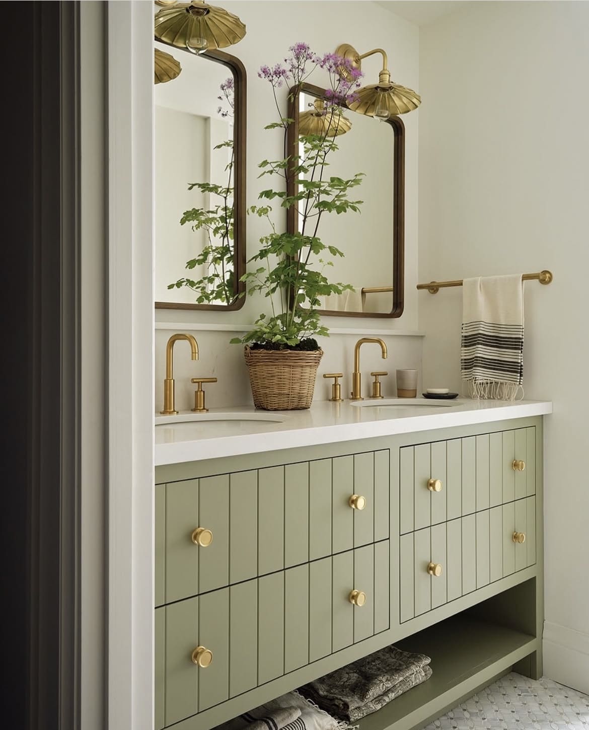
Warm neutrals are set to continue taking centre stage in 2025, with Benjamin Moore announcing Cinnamon Slate as their color of the year – a beautiful, heathery, plum based brown.
Richer, warmer neutrals are the perfect backdrop for creating cosy spaces that make us feel good. There’s no stark whites or cool neutrals in sight here.
The beauty of these warm neutrals that I’ve rounded up is that they work well in both north and south facing aspect rooms. Here you’ll find 15 of the most on-trend neutrals for every room to help kickstart your decorating plans in 2025!
2025’s Best Benjamin Moore Warm Neutrals for Every Room
Before I get into it, here are a few guidelines that will help you choose the best warm neutrals for your room.
If you’re tackling a north facing space, always look for neutrals with a yellow, red, pink or green undertone. They’ll instantly warm up a dark room, and they’ll counteract any blue light that the room receives.
Now, if you’re decorating a sunny, south facing room, you can use virtually any color here. Although, the intensity of the sun does work better with slightly darker neutrals to balance the sun and bring a more subtle feel to the room.
I always recommend grabbing a tester pot first, or peel and stick samples that you can move around the space, it’s important to see how the color looks in your space, and light throughout the day to make a judgement on color.
Now, let’s get into it!
1.Stone Hearth
Stony neutrals are among my favourites for creating a warm, natural inspired scheme. Stone Hearth brings depth and interest to a space with its warm undertones.
It’s a modern neutral that looks beautiful with defining black accents that work in modern, farmhouse, Japandi and earthy inspired design schemes.
Pair with: blacks, greens, whites, creams, wooden tones.

2. Glacier White
Glacier White is one of the shades in the 2025 color palette of shades that complement Cinnamon Slate. The lightest neutral I am featuring in this round up, this versatile off-white features hushed cream undertones for subtle warmth.
If you’re looking for an alternative to a bright white on a ceiling or trim, this is a beautiful alternative, especially for cool north facing rooms.
Pair with: virtually any color works with Glacier White! Consider the rest of the Benjamin Moore 2025 color palette for a seamless scheme.

3. Swiss Coffee
One of Benjamin Moore’s best selling colors for a reason, this popular off-white has the perfect amount of warmth for a shade that works in literally any room, no matter the aspect.
It’s so easy to pair darker, more defining shades with this color and I love it for use in a farmhouse or earthy scheme. Layer with greens, browns, and warm creams for the most beautiful color scheme.
Pair with: greens, browns, creams, gold accents, wooden tones.

4. Proposal
Yes, seriously, a pink! With a pale wash of gray, this pink gives the versatility of a neutral and it’s a refreshing alternative if you’re not a fan of beige or overly yellow off-whites.
I always recommend opting for yellow, pink or red based neutrals in a cold or north facing room as they help to counteract any blue light that the room receives.
Pair with: creams, whites, blues, greens, grays.

5. Edgecomb Gray
Whilst cool greys are out, this classic gray is well known for its soft and timeless appearance, Edgecomb Gray is the perfect paint color that can appear as a light beige, a warm gray or a pale taupe, depending on the light you’re looking at it in.
Pair with: black, green, white, creams, blue, wooden tones.

6. Manchester Tan
Described as a ‘fresh, sophisticated beige that conjures stately sandstone façades’, if you’re looking for the perfect cream/beige, this could well be it!
Take inspiration from the below to see how beautifully it pairs with crisp whites, blacks and neutral tones in this modern dining room.
Pair with: whites, blacks, wooden tones, greens, reds.

7. Alexandria Beige
It’s all about digging deep and reaching for those warmer, richer shades this year, and warm taupes and cozy browns remain a key paint trend for 2025.
Alexandria Beige ticks all the boxes!A versatile taupe that virtually goes with any colors, it has both warm and cool undertones for a metamorphic quality.
Pair with: blues, whites, creams, blacks, greens, reds, yellows.

8. Pashmina
This sophisticated neutral is perfect for a cool north facing room. It has a stony, almost light taupe feel to it and works with almost any interior design scheme.
Pair with: virtually any color works here! For an earthy inspired scheme lean into using whites, creams, greens, browns, blacks and reds.

9. Windham Cream
Buttery yellow tones are a rising paint trend for 2025, it’s hard to feel bad in their company and they’re a great booster in cold, north facing rooms.
This cream color contains a whisper of peach and is a fun shade that would liven up a dark, narrow entryway, or add some fun to a kids nursery room.
Pair with: black, whites, red, wooden tones, creams.

10. Chowning’s Tan
Part of the Benjamin Moore 2025 color palette, it’s hard not to fall head over heels for this color!
Rich, decadent and such a warming shade that connects us to nature. This shade has been created by blending 18th century white and yellow ochre pigments. Pair with shades such as orange to really bring out the best in this warm neutral.
Pair with: orange, reds, whites, creams, greens, blues, wooden tones.

11. Lenox Tan
One of Benjamin Moore’s favorites, this warming khaki color is cocooning and brings a cozy effect to any room it graces.
It has a certain metamorphic quality to it and looks like a khaki, stony and mushroom color, depending on the light you look at it in.
Pair with: Grays, whites, creams, browns, greens, reds, black.

12. French Press
One of the darkest neutrals that I love for 2025 is French Press. A brown-black which looks like roasted espresso beans, imagine how good this color feels in a cozy bedroom or a cinema room.
Despite its dark demeanour, it pairs well with both light and warm colors. Add creams and white tones to instantly lift, or introduce bold reds to challenge the norm.
Pair with: black, whites, creams, reds, yellows.

13. Chelsea Gray
A classic shade of gray with warm undertones makes this a popular and versatile shade for almost any room.
This shade will make a dark room feel ever darker on the darkest days, so unless you’re willing to lean into the darkness, this is a great shade for a sunny south facing room as it will perfectly balance the intensity of the sun.
Pair with: greens, whites, creams, yellow, reds, wooden tones.

14. Dry Sage
An almost neutral shade of green, it’s impossible to feel bad surrounded by this color. Soft greens are the easiest colors on the eye, creating a soothing feel that works in bathrooms, bedrooms and beyond.
Dry Sage is perhaps one of my favorite greens by Benjamin Moore, and it’s one of their most popular ones too.
Pair with: black, wooden tones, brass, whites, creams, deeper greens.

15. Soft Fern
This soft pale green has slight grey undertones to it, and is another contender for that perfect neutral green that works with virtually any color.
Lean into it for a cozy room, layer with creams, browns and natural tones to execute an earthy interior which is stylish, and laidback.
Pair with: black, cream, white, red, wooden tones.

If you have any questions or are looking for more paint recommendations, please leave a comment below and I will come back with my recommendations!
