
The world is your oyster when it comes to decorating a sunny south facing room, as virtually any paint colour works well here. Benefitting from swathes of beautiful light in the room, it makes a world of difference in comparison to your north facing rooms where you need to be smarter about what colours you utilise.
Whilst any colour generally works in a south facing room in practice, very bright colours can feel even more intense and hot on days when there is a lot of light and warmth coming into the room. A prime example of this is a bright white which can feel clinical and harsh on sunny days, and it’s best to be avoided completely!
If you’re ready to tackle your south facing room and are looking for some paint inspiration that will balance with the intensity and warmth of the room, I’ve pulled together 15 of the best Benjamin Moore paint colours to get started with.
Top 15 Benjamin Moore South Facing Room Paint Colors
There isn’t any hard and fast rule of colours to lean into, as south facing rooms vary in the amount of light they receive, and both light and dark colors can be complementary in such a space.
As they are generally lighter spaces that receive most of the sun throughout the day though, I recommend balancing the intensity of the sun with cooler undertones such as grey, green and blue which will create a calmer feel, and a cooler space during the height of summer.
If you have a south facing room, see how the room changes and feels during the course of a sunny day, it will give you a good indication of how a colour can change and how it makes you feel, this is why you should always test your colours before committing!
1.Classic Gray OC-23
Whites are a classic choice for a color scheme, but steer clear of bright whites or those with yellow undertones as they’ll make the room feel uncomfortable to be in during the height of the sun.
Instead, opt for whites with grey undertones such as Classic Gray, shown below. It will bring a beautiful, subtle softness to the room, whilst balancing the intensity of the sun.
This is one of the most popular off-whites in the Benjamin Moore collection, and it really does look beautiful, pairing well with virtually any color.

2. November Rain OC-50
Leaning into green undertones is another way you can be sympathetic to a south facing room, and I always say that it’s difficult to feel bad in a presence of a green, they ground us and keep us connected to the natural world.
This comforting off white has a touch of green and it brings a touch more warmth to a room than one with a grey undertone.

3. Gray Cashmere 2138-60
Soft and soothing in equal measure, this slightly darker off-white combines the best of both worlds with grey and green undertones.
This best selling color in the collection would be perfect in a very sunny south facing bedroom or bathroom, keeping it cool yet stylish throughout the day.
Team with warm accessories, or lean into a coastal feel and use cool tones and warm touches from natural materials such as wood and rattan.

4. Cinnamon Slate 2113-40
This is Benjamin Moore’s colour of 2025, and it’s one of my favourites! A rich, heathery plum based brown that brings a sultry quality to any space.
If you have a particularly sunny room, leaning into a darker shade like this can pay dividends. I recently used a similar shade in our powder room which gets a lot of light in the summer and the color diffuses the light beautifully, creating a dramatic but moody space that works.
Small spaces such as powder rooms or cosy spaces such as living rooms and cinema rooms would be perfect places to try this shade.

5. Stained Glass CSP-685
Blue undertones are typically cool in nature, but they bring such a soothing, serene feel to any room.
Take inspiration from the below and color drench the entire room! It will balance the intensity of the sun in the most beautiful way and will make a larger room feel more inviting, even during the height of the day.
This color can be both grand, regal and look just as good in relaxed coastal interiors.

6. Dry Sage 2142-40
A good sage green has been described as one of the easiest colors on the eye, it’s not over stimulating, but it is soothing which means it’s a suitable choice for most rooms in the home.
Dry sage could almost be classed as a neutral, it brings a sense of ease and softness with it. Use in an earthy interior scheme for the most perfect base, layer with browns, creams, whites and reds for a fun, yet relaxed scheme.

7. Beacon Gray 2128-60
This light blue gray is a light-mid tone blue that just feels good to be around. As a child, it was ingrained into me that blue was a cold color, but the right blue brings a sense of relief and what we’re seeing in 2025 for trending paint colors, is that a good light to mid tone of blue is the new neutral.
The color that can uplift, brighten, but also work with the height of sun to keep a room feeling relaxed, and cool still. You also don’t have to have a baby boy’s nursery to use this shade of blue, it’s particularly good in a bathroom or living room.

8. Baywood Brown 1234
Warm in nature, you can still get away with this muted neutral in a south facing room because of the combination of both red and brown undertones, the brown keeps it grounded and makes the color softer.
This neutral will work hard for you in a south facing room, yet is surprisingly warm when needed on those darker days.

9. Cloud White OC-130
Soft and beautifully balanced, Cloud White is a fine contender in the search for an off-white that works well in sunny spaces.
This popular white will liven up a space and keep it feeling warm and cosy even on those darker, dreary days. This is so important to remember when picking a shade for a south facing room, it needs to be able to perform well for both extremes.

10. Carolina Gull
Can you see from the below image how a comfortable shade of green can feel both uplifting and cooling at the same time?
It has a certain quality to it that makes it appropriate for any room, no matter the orientation it carries. Carolina Gull has notes of gray and warm greens which makes it a versatile green for an interior.

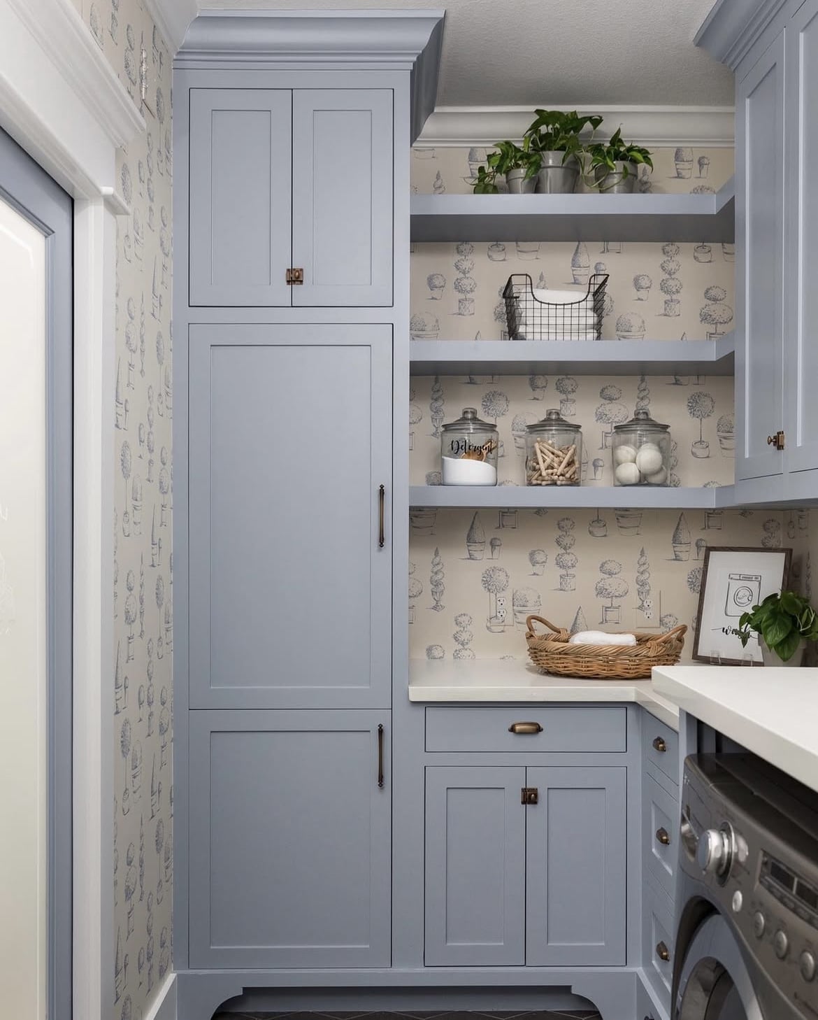
11. New Hope Gray 2130-50
This much loved gray has the most metamorphic qualities to it, depending on the light the room is receiving it appears as a gray or a blue.
Classed as a versatile neutral, it has the tranquil tones of a river with the sleek gray of concrete. Look how good it feels and looks on the cabinetry in the image below.
12. Edgecomb Gray HC-173
Could this be Benjamin Moore’s most popular neutral ever?
This easy on the eye neutral is actually the perfect solution for any room, be it north or south facing. It can provide a warm, welcoming feeling whilst the cooler undertones give it a subtle finish.

13. White Wisp OC-54
If you’re looking for something that is as close to a bright white as possible, but won’t feel clinical when the sun hits, this might be the most perfect south facing off-white.
A gently cool white with very slight undertones of grey, this shade reminds me very much of Farrow and Ball Wevet which is my absolute go-to white for a sunny south facing room.
Off-whites like this will keep a room feeling light, no matter the weather, but they have the most subtle softness that cools down the sun, whilst making the room still feel cosy.

14. Beach Glass 1564
Beach Glass reads green, gray, or blue depending on the light the room is receiving at the time, it keeps things visually interesting in the space!
It features a gray undertone which adds versatility to this calming blue. Use in bathrooms, bedrooms, living rooms and beyond!

15. Sea Salt CSP-95
Also part of Benjamin Moore’s 2025 color palette, Sea Salt is a nuanced neutral that so cleverly flits and balances between warm and cool tones, making this another ideal off-white that looks great throughout an entire house.
You can even see this quality in the below image where the lights hitting. It looks like a soft grey on the right hand side of the image, with it looking more like it has a warm yellow undertone on the left.

Remember to always grab a tester pot before committing! Peel and stick samples are one of the best ways to sample paint, allowing you to move the sample around the room to the lightest and darkest areas to see how the color performs for you.
If you’d like more advice on colors specific to your space, please leave me a comment below and I’ll come straight back with my recommendations, happy painting!